01Overview
Built to get dirty.
ApeSmash is a self-initiated concept exploring the identity of an outdoor obstacle park, an experience centred around physical challenges, adventure and getting stuck in.
The visual direction captures that energy through bold typography, a high-contrast colour palette and direct campaign messaging, creating a recognisable brand with a confident, playful personality.

02Brand System
Made to work beyond the logo.
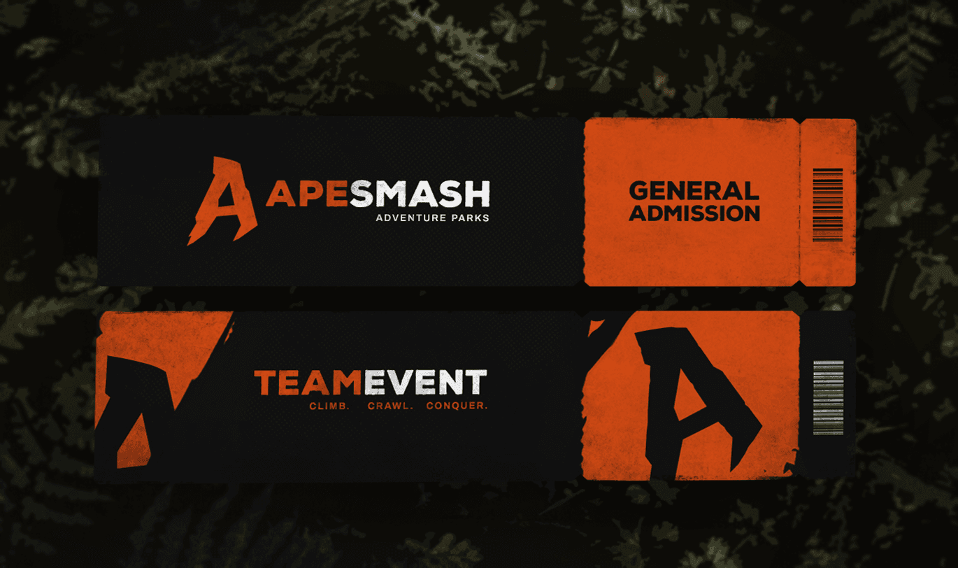
The identity extends across a range of applications, from promotional campaigns and digital content to tickets and park maps.
Consistent typography, colour and graphic elements connect each piece, while allowing the layout and messaging to adapt to its purpose. The result is a cohesive visual system designed to work before, during and after the experience.